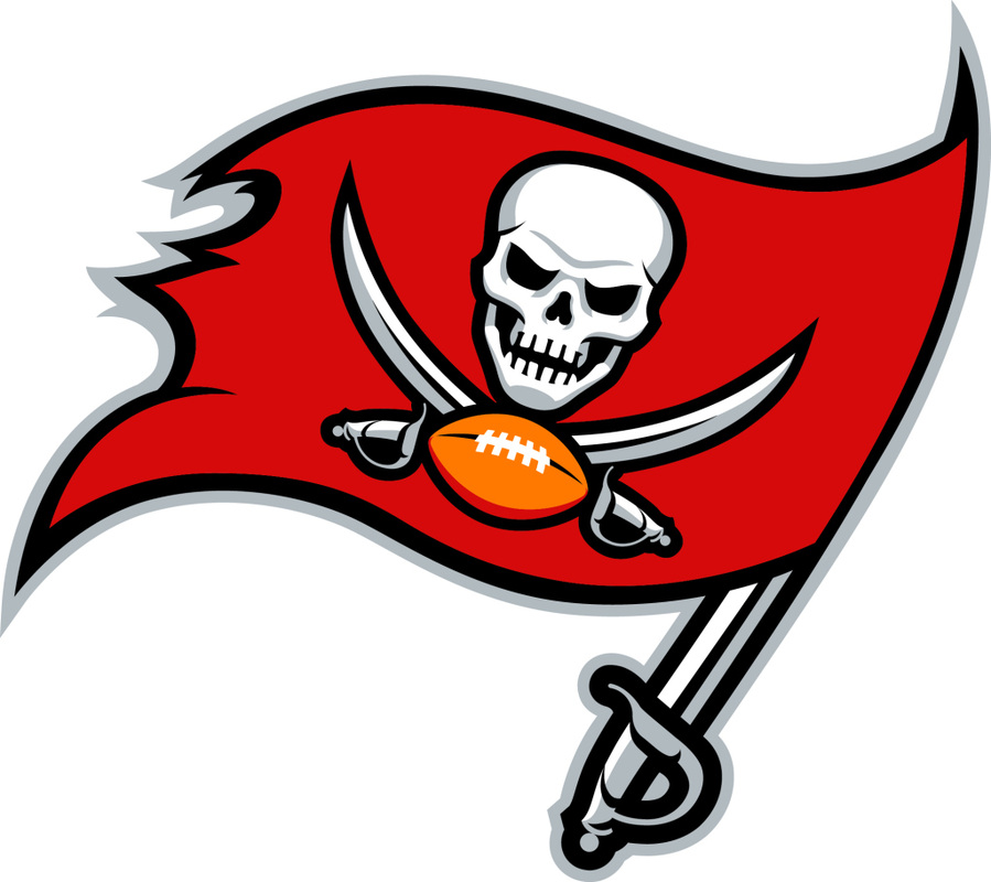
I do live within the Tampa Bay region, so this is a little more personal than most would have it. On Thursday February 20th, Warren Sapp and Gerald McCoy announced and displayed the new Helmet and Logo that will represent the Tampa Bay Buccaneers. This is suppose to signify a new life, new era, for the Tampa Bay Buccaneers. Some have criticized it for lack of "real" changes, and even locally it has been referred to as a "waste of money". Which I understand and respect both view points, but that is not entirely true.
One criticism I do agree with, is the overall size. It looks like the old logo was increased in size 300%. In looking at photos of it, it actually makes sense for the size. They want it to seem and feel more intimidating, which, in all honesty it would. If you also look at the angle of the flags, it represents more of the helmet. I can see why it was done, but I think the design could be smaller and have a little bit different look for the top of the helmet. At the same time, you cannot please everybody.
As for the design not really changing, while that is half true, lets look at both designs. The design originally looks like a tattered flag. It looks like it weathered some storms and really has a 90's feel to it. Just like the current Broncos logo. The new Buccaneer logo, the flag looks sorta tattered but more so like it is "new", the skull looks more devious, the swords actually look a lot better. The older one looked kiddy on the swords, these look like they can do some damage. The football on the old logo looked weird to me, and always had. I never understood the shading on the bottom. The new logo removed the shading from the football as well as the skull.
As for the waste of money aspect, please bear in mind that with the pursuant of Lovie Smith, the Glazers are trying to signify a "new era" for Buccaneer Football. Much like they did with Tony Dungy, so a new logo is not too far fetched. I just hope that with all this being done, that they keep with this "new era" and show the Tampa Bay Fans some love. Spend money, make a good team, win Championships.

 RSS Feed